Figure 2.1: Hurriane Floyd, 1999
| ||
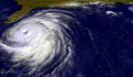 Figure 2.1: Satellite image of Hurricane Floyd approaching the east coast of Florida in 1999. The image has been digitally enhanced to lend a three-dimensional perspective. NASA/Goddard Space Flight Center. Figure 2.1: Satellite image of Hurricane Floyd approaching the east coast of Florida in 1999. The image has been digitally enhanced to lend a three-dimensional perspective. NASA/Goddard Space Flight Center. |
||
Figure 2.2: The eye of Hurricane Emilia over the eastern North Pacific
| ||
 Figure 2.2: The eye of Hurricane Emilia over the eastern North Pacific, as seen from directly above by the crew of the space shuttle Columbia on July 19, 1994, at 19:33 GMT. At this time, Emilia had maximum winds of 70 m/s (155 mph). NASA Johnson Space Center Digital Image Collection.
 |
||
Figure 2.3: The eye of Hurricane Georges
| ||
 Figure 2.3: The eye of Hurricane Georges in photo taken from a reconnaissance aircraft. The eyewall at right is casting a shadow across part of the eyewall ahead. Courtesy of Michael Black, Hurricane Research Division, NOAA-AOML, Miami, Florida. Figure 2.3: The eye of Hurricane Georges in photo taken from a reconnaissance aircraft. The eyewall at right is casting a shadow across part of the eyewall ahead. Courtesy of Michael Black, Hurricane Research Division, NOAA-AOML, Miami, Florida. |
||
Figure 2.4: Radar reflectivity in the eye of Hurricane Floyd of 1999
| ||
 Figure 2.4: Radar reflectivity measure from a hurricane reconnaissance aircraft flying in the eye of Hurricane Floyd of 1999. Map is 360 km (225 miles) square. The radar reflectivity measures roughly how much rain, snow and hail is in the air. Courtesy of Frank Marks, Hurricane Research Division, NOAA-AOML, Miami, Florida.
 |
||
Figure 2.5: Vertical cross-section of radar reflectivity in Hurricane Floyd of 1999.
| ||
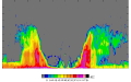 Figure 2.5: Vertical cross-section of radar reflectivity in Hurricane Floyd of 1999, made from hurricane reconnaissance aircraft in the eye, located at the "+" sign. The diagram spans 20 km (12.5 miles) in height and 120 km (75 miles) across. Courtesy of Frank Marks, Hurricane Research Division, NOAA-AOML, Miami, Florida. Figure 2.5: Vertical cross-section of radar reflectivity in Hurricane Floyd of 1999, made from hurricane reconnaissance aircraft in the eye, located at the "+" sign. The diagram spans 20 km (12.5 miles) in height and 120 km (75 miles) across. Courtesy of Frank Marks, Hurricane Research Division, NOAA-AOML, Miami, Florida. |
||
Figure 2.6, top: Composite view of the distribution of wind speed in a hurricane
| ||
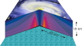 Figure 2.6, top: Composite view of the distribution of wind speed in a hurricane, as revealed by measurements made from research aircraft. The center of the hurricane is in the center of the panel and the cutaway extends outward about 120 km (75 miles) and upward to about 18 km (11 miles).
 |
||
Figure 2.6, middle: Composite view of the distribution of temperature perturbation in a hurricane
| ||
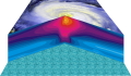 Figure 2.6, middle: Composite view of the distribution of temperature perturbation in a hurricane, as revealed by measurements made from research aircraft. The center of the hurricane is in the center of the panel and the cutaway extends outward about 120 km (75 miles) and upward to about 18 km (11 miles). Figure 2.6, middle: Composite view of the distribution of temperature perturbation in a hurricane, as revealed by measurements made from research aircraft. The center of the hurricane is in the center of the panel and the cutaway extends outward about 120 km (75 miles) and upward to about 18 km (11 miles). |
||
Figure 2.6, bottom: Composite view of the distribution of entropy in a hurricane
| ||
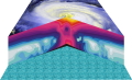 Figure 2.6, bottom: Composite view of the distribution of entropy in a hurricane, as revealed by measurements made from research aircraft. The center of the hurricane is in the center of the panel and the cutaway extends outward about 120 km (75 miles) and upward to about 18 km (11 miles). Entropy is a measure of the heat content of air.
 |
||
Figure 2.7, top: Composite view of the distribution of radial air motion in a hurricane
| ||
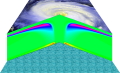 Figure 2.7, top: Composite view of the distribution of radial air motion in a hurricane, as calculated using a computer model. The center of the hurricane is in the center of the panel and the cutaway extends outward about 120 km (75 miles) and upward to about 18 km (11 miles). Figure 2.7, top: Composite view of the distribution of radial air motion in a hurricane, as calculated using a computer model. The center of the hurricane is in the center of the panel and the cutaway extends outward about 120 km (75 miles) and upward to about 18 km (11 miles). |
||
Figure 2.7, bottom: Composite view of the distribution of vertical air motion in a hurricane
| ||
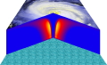 Figure 2.7, bottom: Composite view of the distribution of vertical air motion in a hurricane, as calculated using a computer model. The center of the hurricane is in the center of the panel and the cutaway extends outward about 120 km (75 miles) and upward to about 18 km (11 miles).
 |
||
Figure 2.8: Synopsis of hurricane structure
| ||
Figure 3.3: Universal symbol of the tropical cyclone
| ||
 Figure 3.3: Universal symbol of the tropical cyclone. In the southern hemisphere, the arms are curved in the opposite sense.
 |
||
Figure 4.1: Solar and terrestrial radiation
| ||
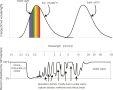 Figure 4.1: The top panel shows the amount of energy per unit wavelength (here multiplied by wavelength) as a function of the wavelength itself, which is given by the axis in the middle. The wavelengths are given in microns: one micron is one millionth of a meter. The curve at the left shows the energy content of sunlight; the colors denote the visible part of the spectrum. The curve at the right shows the spectrum of terrestrial, or infrared, radiation. The bottom panel shows the percentage of energy that is absorbed at each wavelength by various gases in the atmosphere. Figure 4.1: The top panel shows the amount of energy per unit wavelength (here multiplied by wavelength) as a function of the wavelength itself, which is given by the axis in the middle. The wavelengths are given in microns: one micron is one millionth of a meter. The curve at the left shows the energy content of sunlight; the colors denote the visible part of the spectrum. The curve at the right shows the spectrum of terrestrial, or infrared, radiation. The bottom panel shows the percentage of energy that is absorbed at each wavelength by various gases in the atmosphere. |
||
Figure 4.2: Bi-atomic molecule
| ||
 Figure 4.2: Cartoon of a simple molecule consisting of two atoms. The primary gases of our atmosphere, nitrogen (N2) and oxygen (O2), have this form.
 |
||
Figure 4.3: Tri-atomic molecule
| ||
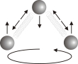 Figure 4.3: Cartoon of a tri-atomic molecule, like water vapor (H2O) and carbon dioxide (CO2). Figure 4.3: Cartoon of a tri-atomic molecule, like water vapor (H2O) and carbon dioxide (CO2). |
||
Figure 4.4: The heat balance of the tropical atmosphere
| ||
Figure 6.1: Three stages in the development of a typical tropical rain shower.
| ||
 Figure 6.1: Three stages in the development of a typical tropical rain shower. During the first stage (left), a cumulus cloud grows upward, but precipitation has not yet formed. After 20 minutes or so, rain begins to fall as the mature stage is reached (middle). Some of the rain evaporates, chilling the air and causing a downdraft that spreads out at the surface. After another half hour or so, this spreading, rain-cooled air cuts off the supply of warm, moist air feeding the storm, which then begins to dissipate (right). Based on a diagram by C. Doswell. Figure 6.1: Three stages in the development of a typical tropical rain shower. During the first stage (left), a cumulus cloud grows upward, but precipitation has not yet formed. After 20 minutes or so, rain begins to fall as the mature stage is reached (middle). Some of the rain evaporates, chilling the air and causing a downdraft that spreads out at the surface. After another half hour or so, this spreading, rain-cooled air cuts off the supply of warm, moist air feeding the storm, which then begins to dissipate (right). Based on a diagram by C. Doswell. |
||
Figure 8.2: Angular momentum
| ||
 Figure 8.2: The arrows on this globe show the speed of fixed points on the earth's surface with respect to a stationary observer in space, due to the planet's rotation. Points on the equator are moving rapidly from west to east, while those at higher latitudes move more slowly.
 |
||
Figure 8.4: Trade cumuli
| ||
 Figure 8.4: Trade cumulus clouds are a trademark of the tropical skyscape. NOAA Central Library Photo Collection/ Ralph F. Kresge. Figure 8.4: Trade cumulus clouds are a trademark of the tropical skyscape. NOAA Central Library Photo Collection/ Ralph F. Kresge. |
||
Figure 8.5: Winds over the Pacific
| ||
 Figure 8.5: Map showing winds over the Pacific Ocean, as measured by a scatterometer aboard NASA's Quickscat satellite. The direction of the wind is shown by the white curves with arrows, and the colors show the wind speed as given by the bar scale at right. The scatterometer transmits pulses of microwave radiation that are backscattered from capillary waves (ripples) on the sea surface. By measuring how much radiation is returned, the height of the capillary waves can be estimated, and this is proportional to the wind speed. As the satellite passes overhead, it transmits pulses at various angles to the sea surface; by measuring how much radiation is returned as a function of the angle, the orientation of the capillary waves can be estimated, and this gives the wind direction. Courtesy W. Timothy Liu, JPL, NASA.
 |
||
Figure 10.1: Carnot cycle
| ||
 Figure 10.1: The four steps of the classical Carnot energy cycle. Figure 10.1: The four steps of the classical Carnot energy cycle. |
||
Figure 10.2: Energy cycle of a mature hurricane
| ||
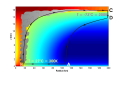 Figure 10.2: The energy cycle of a mature hurricane. Air spirals inward close to the sea surface, between Points A and B, acquiring heat from the ocean by evaporation of seawater. Air then ascends in the eyewall, from B to C without acquiring or losing heat other than that produced when water vapor condenses. Between C and D the air loses the heat it originally acquired from the ocean. Finally, between D and A, the air returns to its starting point. In a real hurricane, the energy cycle is open because hurricanes continuously exchange air with their environment (see text). The colors show a measure of the air's heat content, with warm colors corresponding to high heat content.
 |
||
Figure 10.3: Potential intensity of hurricanes
| ||
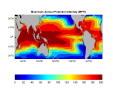 Figure 10.3: Map showing the maximum wind speed (in MPH) achievable by hurricanes over the course of an average year, according to Carnot's theory of heat engines. Figure 10.3: Map showing the maximum wind speed (in MPH) achievable by hurricanes over the course of an average year, according to Carnot's theory of heat engines. |
||
Figure 11.1: Hurricanes of 1780
| ||
 Figure 11.1: Tracks of the three hurricanes of October, 1780. Numbers indicate dates. These tracks are based on ship and land observations, from Tannehill (1952).
 |
||
Figure 12.1: Cumulative distribution of Atlantic hurricane intensity
| ||
 Figure 12.1: Total number of events in the Atlantic, from 1958-1997 and the western North Pacific, from 1970 to 1987, whose ratio of actual to potential maximum wind speed exceeds the value on the x axis. Figure 12.1: Total number of events in the Atlantic, from 1958-1997 and the western North Pacific, from 1970 to 1987, whose ratio of actual to potential maximum wind speed exceeds the value on the x axis. |
||
Figure 12.2: Wind shear
| ||
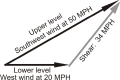 Figure 12.2: This diagram shows how shear is defined. Here a westerly wind of 20 MPH is blowing near the surface, while higher up the wind is from the west-southwest at 50 MPH. The shear between these two levels is a vector pointing toward the northeast with a magnitude of 34 MPH.
 |
||
Figure 12.3: Shear affecting Tropical Storm Barry
| ||
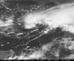 Figure 12.3: Tropical Storm Barry in the central Gulf of Mexico on August 2nd, 2001. Note that the deep convective clouds are arranged in an open arc around the storm center rather than completely enclosing it. This shows the effect of vertical wind shear which, at this time, was directed toward the north. University of Wisconsin, Space Science and Engineering Center. Figure 12.3: Tropical Storm Barry in the central Gulf of Mexico on August 2nd, 2001. Note that the deep convective clouds are arranged in an open arc around the storm center rather than completely enclosing it. This shows the effect of vertical wind shear which, at this time, was directed toward the north. University of Wisconsin, Space Science and Engineering Center. |
||
Figure 12.5: Hurricane effect on sea surface temperature
| ||
 Figure 12.5: A satellite infrared image showing the sea surface temperature distribution of the western North Atlantic on September 2nd and 3rd 1996, shortly after Hurricane Edouard passed along the black curve shown in the image. The color scale is shown at lower right. (The white patches are clouds.) Along and to the right of the path of Edouard, the sea surface temperature has decreased by as much as 5 degrees centigrade. Image courtesy of the Johns Hopkins University Applied Physics Laboratory.
 |
||
Figure 12.6: Wind and ocean currents
| ||
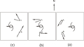 Figure 12.6: Wind and current directions at two points (A and B) to the left and right of the track of a hurricane in the northern hemisphere. Read figure from right to left, as the hurricane passes in between points A and B. The solid black arrows give the wind direction and the white arrows show the ocean current direction. See text for explanation. Figure 12.6: Wind and current directions at two points (A and B) to the left and right of the track of a hurricane in the northern hemisphere. Read figure from right to left, as the hurricane passes in between points A and B. The solid black arrows give the wind direction and the white arrows show the ocean current direction. See text for explanation. |
||
Figure 12.7: Ocean currents and mixed layer depths under a hurricane
| ||
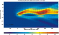 Figure 12.7: Horizontal map showing the ocean currents and mixed layer depths under a hurricane moving along the black line from right to left, generated from a computer simulation. The storm is currently located at the black asterisk. The ocean current direction is given by the black arrows, whose length is proportional to its speed. The colors show the thickness of the ocean mixed layer (in meters), with color scale at bottom. Courtesy Rob Korty.
 |
||
Figure 12.8: Evolution of the maximum wind speed in Tropical Storm Barry
| ||
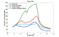 Figure 12.8: Evolution of the maximum wind speed in Tropical Storm Barry of 2001. The blue curve shows the wind speed estimated from observations and the other curves show various attempts to simulate this with a computer model, including a simulation without ocean mixing (green), a simulation with ocean mixing but without wind shear (red), and a simulation with both ocean mixing and shear (light blue). Figure 12.8: Evolution of the maximum wind speed in Tropical Storm Barry of 2001. The blue curve shows the wind speed estimated from observations and the other curves show various attempts to simulate this with a computer model, including a simulation without ocean mixing (green), a simulation with ocean mixing but without wind shear (red), and a simulation with both ocean mixing and shear (light blue). |
||
Figure 13.1: Track of the Galveston Hurricane of 1900
| ||
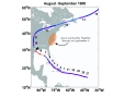 Figure 13.1: Track of the deadly Galveston Hurricane of August-September 1900. The red dots show the storm's position each day, beginning on August 27th. The orange patch shows the area warned by the U.S. Weather Bureau on September 6th, when the storm was just off Key West. Colors on tracks show storm strength category: Dark blue: tropical storm; light blue: Cat1; green: Cat2; yellow: Cat3; orange: Cat4; red: Cat5.
 |
||
Figure 13.2, top: Maximum winds in Galveston hurricane
| ||
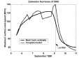 Figure 13.2, top: Computer simulation of the evolution of the maximum wind speed of the Galveston Hurricane of 1900. Also shown is an estimate of the actual maximum wind speed in the storm, using what few observations were available. Figure 13.2, top: Computer simulation of the evolution of the maximum wind speed of the Galveston Hurricane of 1900. Also shown is an estimate of the actual maximum wind speed in the storm, using what few observations were available. |
||
Figure 13.2, bottom: Surface pressure in Galveston hurricane
| ||
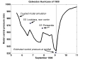 Figure 13.2, bottom: Computer simulation of the evolution of the minimum surface pressure of the Galveston Hurricane of 1900. Surface pressures recorded on two ships and at Galveston are shown.
 |
||
Figure 13.3: Effect of shoaling water
| ||
 Figure 13.3: A hurricane offshore continually cools the warm layer of seawater near the surface, by stirring in cold water from below. But as the storm approaches land, the shoaling sea bottom cuts off the supply of cold water, and the surface waters remain warm, intensifying the hurricane. Figure 13.3: A hurricane offshore continually cools the warm layer of seawater near the surface, by stirring in cold water from below. But as the storm approaches land, the shoaling sea bottom cuts off the supply of cold water, and the surface waters remain warm, intensifying the hurricane. |
||
Figure 14.1: Origin points of tropical cyclones
| ||
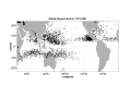 Figure 14.1: Origin points of tropical cyclones over a 30 year period.
 |
||
Figure 14.2: Seasonal storm frequency
| ||
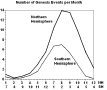 Figure 14.2: The average number of tropical cyclones per month in the northern and southern hemispheres. Figure 14.2: The average number of tropical cyclones per month in the northern and southern hemispheres. |
||
Figure 14.3: Evolution of the maximum wind speed in two computer hurricane simulations
| ||
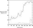 Figure 14.3: Evolution of the maximum wind speed in two computer hurricane simulations. The first, given by the solid curve, begins with a vortex whose maximum wind speed is 12 m/s (27 mph) and the second uses an initial vortex with maximum winds of only 2 m/s (5 mph).
 |
||
Figure 14.4: Profile of relative humidity in the tropical atmosphere
| ||
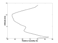 Figure 14.4: A typical profile of relative humidity in the tropical atmosphere. Figure 14.4: A typical profile of relative humidity in the tropical atmosphere. |
||
Figure 14.5: Cooling and drying of tropical boundary layer by convection
| ||
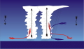 Figure 14.5: The congregation of tropical convective clouds leads to a local concentration of both updrafts (red arrows) and downdrafts (blue arrows). The downdrafts bring low energy down to the surface from middle levels of the atmosphere.
 |
||
Figure 14.6: Factors influencing intensification of tropical disturbances
| ||
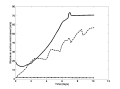 Figure 14.6: The evolution of the maximum wind speed in three computer simulations of tropical disturbances. In the first (solid curve), the simulation is started with a vortex whose maximum wind speed is 18 m/s (40 mph). The second simulation (dashed curve) is like the first but starts from a maximum wind speed of only 2 m/s (5 mph). The third simulation (dash-dot curve) is like the second, but the atmosphere has first been humidified in a column 160 km (100 miles) across, centered on the storm. Figure 14.6: The evolution of the maximum wind speed in three computer simulations of tropical disturbances. In the first (solid curve), the simulation is started with a vortex whose maximum wind speed is 18 m/s (40 mph). The second simulation (dashed curve) is like the first but starts from a maximum wind speed of only 2 m/s (5 mph). The third simulation (dash-dot curve) is like the second, but the atmosphere has first been humidified in a column 160 km (100 miles) across, centered on the storm. |
||
Figure 14.7: Genesis index
| ||
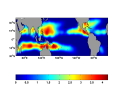 Figure 14.7: Map showing the maximum monthly value of a genesis index over the course of a year. This index has been calculated using monthly average values of wind shear, relative humidity and potential intensity; the units of the index are arbitrary.
 |
||
Figure 14.8: African easterly wave
| ||
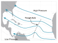 Figure 14.8: Sketch of a typical African easterly wave, as it might appear on a map of pressure and air flow about 3 km (2 miles) above the surface. The black curves show isobars - lines of equal pressure - and the blue arrows show the air flow. The dashed black line marked "trough" shows the location of the wave axis, where there is a pressure trough and the airflow is cyclonic. Figure 14.8: Sketch of a typical African easterly wave, as it might appear on a map of pressure and air flow about 3 km (2 miles) above the surface. The black curves show isobars - lines of equal pressure - and the blue arrows show the air flow. The dashed black line marked "trough" shows the location of the wave axis, where there is a pressure trough and the airflow is cyclonic. |
||
Figure 14.9: Cross-section through easterly wave
| ||
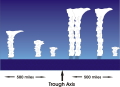 Figure 14.9: Sketch of the distribution of clouds and rain showers around an easterly wave, whose axis is in the center of the diagram. This distribution is characteristic of waves traversing the central and western North Atlantic.
 |
||
Figure 14.10: Satellite photo of the tropical North Atlantic on August 31st, 1996
| ||
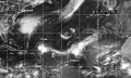 Figure 14.10: Satellite photo of the tropical North Atlantic on August 31st, 1996, showing various stages in the evolution of tropical disturbances. An easterly wave is just emerging over the ocean from western Africa. Further west, another such wave has developed into a tropical depression that will become tropical storm Gustav. The wave before that has become Hurricane Fran, northeast of the Virgin Islands, and the preceding wave is now fully developed Hurricane Edouard. Naval Research Laboratory, Marine Meteorology Division. Figure 14.10: Satellite photo of the tropical North Atlantic on August 31st, 1996, showing various stages in the evolution of tropical disturbances. An easterly wave is just emerging over the ocean from western Africa. Further west, another such wave has developed into a tropical depression that will become tropical storm Gustav. The wave before that has become Hurricane Fran, northeast of the Virgin Islands, and the preceding wave is now fully developed Hurricane Edouard. Naval Research Laboratory, Marine Meteorology Division. |
||
Figure 15.1: Track of the Miami Hurricane of September 1926
| ||
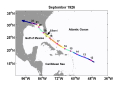 Figure 15.1: Track of the Miami Hurricane of September 1926. Positions shown are at noon Universal Time. Colors on tracks show storm strength category: Dark blue: tropical storm; light blue: Cat1; green: Cat2; yellow: Cat3; orange: Cat4; red: Cat5.
 |
||
Figure 15.2: Miami at the height of the 1926 hurricane
| ||
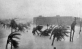 Figure 15.2: Miami at the height of the 1926 hurricane. Florida State Archives. Figure 15.2: Miami at the height of the 1926 hurricane. Florida State Archives. |
||
Figure 16.1: Decay of storm winds after landfall
| ||
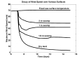 Figure 16.1: Decay of storm winds after landfall, assuming that the maximum wind speed at landfall is 68 m/s (150 MPH). Each curve shows the decrease of wind speed with time in storms making landfall at 7 days, on the time scale shown on the bottom axis. The bottom curve is for storms moving inland over flat, dry ground, while the other curves represent storms moving over swamps of various depths. The top curve, provided for reference, is for a storm that remains at sea.
 |
||
Figure 16.2: Evolution of the maximum wind speed in Hurricane Andrew
| ||
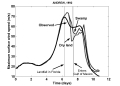 Figure 16.2: Observed evolution of the maximum wind speed in Hurricane Andrew (solid curve) compared to two computer simulations. In the first, southern Florida is assumed to be dry land while in the second the Everglades are accounted for. Figure 16.2: Observed evolution of the maximum wind speed in Hurricane Andrew (solid curve) compared to two computer simulations. In the first, southern Florida is assumed to be dry land while in the second the Everglades are accounted for. |
||
Figure 16.3: Track of Hurricane Hazel
| ||
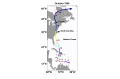 Figure 16.3: Track of Hurricane Hazel. Numbers are dates in October corresponding to 00 UT positions, shown by the red circles. Colors on tracks show storm strength category: Dark blue: tropical storm; light blue: Cat1; green: Cat2; yellow: Cat3; orange: Cat4; red: Cat5.
 |
||
Figure 16.4: Track of Hurricane Irene
| ||
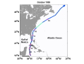 Figure 16.4: Track of Hurricane Irene. Numbers are dates in October corresponding to 00 UT positions, shown by the red circles. Colors on tracks show storm strength category: Dark blue: tropical storm; light blue: Cat1; green: Cat2; yellow: Cat3; orange: Cat4; red: Cat5. Figure 16.4: Track of Hurricane Irene. Numbers are dates in October corresponding to 00 UT positions, shown by the red circles. Colors on tracks show storm strength category: Dark blue: tropical storm; light blue: Cat1; green: Cat2; yellow: Cat3; orange: Cat4; red: Cat5. |
||
Figure 16.5: Evolution of the central pressure of Irene
| ||
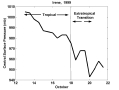 Figure 16.5: Evolution of the central pressure of Irene, showing both tropical and extratropical phases.
 |
||
Figure 16.6: Satellite image of Hurricane Irene
| ||
 Figure 16.6: Satellite image of Hurricane Irene undergoing extratropical transition. Courtesy Steven M. Babin and Ray Sterner, The Johns Hopkins University Applied Physics Laboratory. Figure 16.6: Satellite image of Hurricane Irene undergoing extratropical transition. Courtesy Steven M. Babin and Ray Sterner, The Johns Hopkins University Applied Physics Laboratory. |
||
Figure 16.7, top: The decline of hurricane wind speeds over dry land
| ||
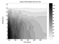 Figure 16.7, top: The decline of hurricane wind speeds at each altitude in computer simulations of a hurricane moving over dry land, starting at 180 hours. The shading shows the wind speed (in mph) according to the scales at right. The simulations use the numerical model developed by Rotunno and Emanuel (1987).
 |
||
Figure 16.7, bottom: The decline of hurricane wind speeds over cold water
| ||
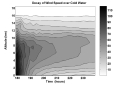 Figure 16.7, bottom: The decline of hurricane wind speeds at each altitude in computer simulations of a hurricane moving over cold ocean water, starting at 180 hours. The shading shows the wind speed (in mph) according to the scales at right. The simulations use the numerical model developed by Rotunno and Emanuel (1987). Figure 16.7, bottom: The decline of hurricane wind speeds at each altitude in computer simulations of a hurricane moving over cold ocean water, starting at 180 hours. The shading shows the wind speed (in mph) according to the scales at right. The simulations use the numerical model developed by Rotunno and Emanuel (1987). |
||
Figure 17.1: Track of the San Felipe Hurricane
| ||
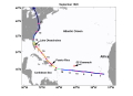 Figure 17.1: Track of the San Felipe Hurricane. Numbers are dates in September corresponding to 00 UT positions, shown by the red circles.
 |
||
Figure 17.2: Evolution of the maximum wind speed in the San Felipe Hurricane
| ||
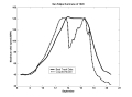 Figure 17.2: Evolution of the maximum wind speed in the San Felipe Hurricane of 1928. The solid curve shows the official estimate and the dashed curve shows the results of a computer simulation. Figure 17.2: Evolution of the maximum wind speed in the San Felipe Hurricane of 1928. The solid curve shows the official estimate and the dashed curve shows the results of a computer simulation. |
||
Figure 18.1a: A simple east-to-west flow.
| ||
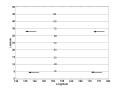 Figure 18.1a: Some idealized tropical flow patterns: A simple east-to-west flow.
 |
||
Figure 18.1b: A circular vortex
| ||
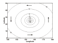 Figure 18.1b: Some idealized tropical flow patterns . A circular vortex, like a hurricane. Figure 18.1b: Some idealized tropical flow patterns . A circular vortex, like a hurricane. |
||
Figure 18.1c: Sum of vortex and constant flows
| ||
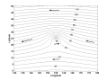 Figure 18.1c: Some idealized tropical flow patterns: Sum of the two flows shown in Figures 18.1a and b, when the vortex is strong.
 |
||
Figure 18.2: Atmospheric flow between two high pressure systems
| ||
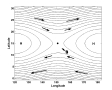 Figure 18.2: Atmospheric flow between two high pressure systems. The dot in the center shows a "saddle point", and a hurricane is located at the "S". Figure 18.2: Atmospheric flow between two high pressure systems. The dot in the center shows a "saddle point", and a hurricane is located at the "S". |
||
Figure 18.3: Conservation of vorticity
| ||
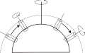 Figure 18.3: This diagram of the Northern Hemisphere shows how columns of air displaced northward and southward acquire spin relative to the earth's surface. The columns here extend from the surface to the tropopause, shown by the dashed curve. The right side shows a column of air displaced southward and acquiring a counterclockwise spin, while on the left, a column displaced northward acquires clockwise spin.
 |
||
Figure 18.4: Beta gyres
| ||
 Figure 18.4: Air moving northward on the east side of a hurricane acquires clockwise spin; air moving southward west of the storm acquires counterclockwise spin. Figure 18.4: Air moving northward on the east side of a hurricane acquires clockwise spin; air moving southward west of the storm acquires counterclockwise spin. |
||
Figure 18.5: Stretching of vorticity
| ||
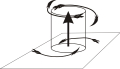 Figure 18.5: Rising air is replaced by converging air flow at low levels and produces diverging outflow aloft. The vorticity of the converging air increases, giving counterclockwise flow, while it decreases in the diverging air, giving clockwise flow. The sense of rotation is opposite in the Southern Hemisphere.
 |
||
Figure 18.6: Wind shear pushes the anticyclone at storm top off to one side
| ||
Figure 18.7: Pacific Typhoon Keith
| ||
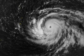 Figure 18.7: Pacific Typhoon Keith of 1997, intensifying toward supertyphoon status. Notice the particularly well developed cloud band west of Keith's core. The counterclockwise spin associated with this cloud band caused Keith to deviate to the north. Defense Meteorological Satellite program, NOAA.
 |
||
Figure 18.8: Dance of Ione and Kristen
| ||
 Figure 18.8: Typhoons Ione and Kristen of 1974, locked in a cyclonic dance. NOAA Central Library Photo Collection/ NOAA in Space Collection. Figure 18.8: Typhoons Ione and Kristen of 1974, locked in a cyclonic dance. NOAA Central Library Photo Collection/ NOAA in Space Collection. |
||
Figure 18.9: Tracks of tropical cyclones
| ||
 Figure 18.9: Tracks of tropical cyclones over ten years (1992-2001 northern hemisphere; 1991-2000 southern hemisphere). Courtesy Dr. Charles S. Neumann.
 |
||
Figure 18.10: Track of Hurricane Elena
| ||
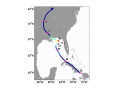 Figure 18.10: Track of Hurricane Elena of 1985. Numbers are dates in September corresponding to 00 UT positions, shown by the red circles. Colors on tracks show storm strength category: Dark blue: tropical storm; light blue: Cat1; green: Cat2; yellow: Cat3; orange: Cat4; red: Cat5. Figure 18.10: Track of Hurricane Elena of 1985. Numbers are dates in September corresponding to 00 UT positions, shown by the red circles. Colors on tracks show storm strength category: Dark blue: tropical storm; light blue: Cat1; green: Cat2; yellow: Cat3; orange: Cat4; red: Cat5. |
||
Figure 19.1: Florida Keys and the track of the Labor Day Hurricane
| ||
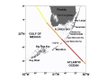 Figure 19.1: Map of the Florida Keys showing the track of the Labor Day Hurricane of 1935. Red indicates Category 5; orange Category 4; and yellow Category 3.
 |
||
Figure 19.2: Track of the Labor Day Hurricane
| ||
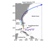 Figure 19.2: Track of the Labor Day Hurricane of 1935. Numbers show dates in August and September, corresponding to positions at 00 UT. Colors on tracks show storm strength category: Dark blue: tropical storm; light blue: Cat1; green: Cat2; yellow: Cat3; orange: Cat4; red: Cat5. Figure 19.2: Track of the Labor Day Hurricane of 1935. Numbers show dates in August and September, corresponding to positions at 00 UT. Colors on tracks show storm strength category: Dark blue: tropical storm; light blue: Cat1; green: Cat2; yellow: Cat3; orange: Cat4; red: Cat5. |
||
Figure 19.3: Maximum wind speeds in the Labor Day Hurricane
| ||
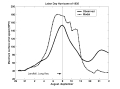 Figure 19.3: Maximum wind speeds in the Labor Day Hurricane of 1935, estimated from observations (solid ) and by computer model (dashed). The vertical line shows the time of landfall in the Keys.
 |
||
Figure 19.4: Central pressure of the Labor Day Hurricane
| ||
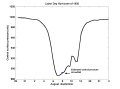 Figure 19.4: Central pressure of the Labor Day Hurricane of 1935 estimated using a computer model. The minimum measured pressure in the Keys is indicated. Figure 19.4: Central pressure of the Labor Day Hurricane of 1935 estimated using a computer model. The minimum measured pressure in the Keys is indicated. |
||
Figure 20.1: Storm surge physics
| ||
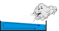 Figure 20.1: Air blown across the surface of a partially filled box piles up water on its downwind side.
 |
||
Figure 20.3: Storm surge from the Great New England Hurricane
| ||
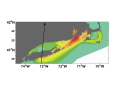 Figure 20.2: The maximum storm surge height during the New England Hurricane of 1938. Contour interval is 0.3 meters, with height ranging from 1.8 meters to 5.1 meters. The storm center moved along the path shown by the arrow. After Redfield and Miller (1957). Figure 20.2: The maximum storm surge height during the New England Hurricane of 1938. Contour interval is 0.3 meters, with height ranging from 1.8 meters to 5.1 meters. The storm center moved along the path shown by the arrow. After Redfield and Miller (1957). |
||
Figure 20.3: Storm surges recorded at Atlantic City, New Jersey, during the passage of a storm offshore
| ||
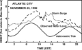 Figure 20.3: Storm surges recorded at Atlantic City, New Jersey, during the passage of a storm offshore. The solid curve shows the normal swing of the tides, the dashed curve shows the observed sea level, and the dotted curve shows the part of the sea level rise attributable to the storm surges. After Swanson (1976).
 |
||
Figure 20.5: Hurricane Carol storm surge
| ||
 Figure 20.5: Storm surge of Hurricane Carol floods a Rhode Island Yacht Club in 1954. NOAA Central Library Photo Collection. Figure 20.5: Storm surge of Hurricane Carol floods a Rhode Island Yacht Club in 1954. NOAA Central Library Photo Collection. |
||
Figure 21.1: Track of the Great New England Hurricane
| ||
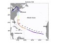 Figure 21.1: Track of the Great New England Hurricane of 1938. The numbers show dates in September corresponding to storm positions at 00 UT. Colors on tracks show storm strength category: Dark blue: tropical storm; light blue: Cat1; green: Cat2; yellow: Cat3; orange: Cat4; red: Cat5.
 |
||
Figure 21.2: Pressure and winds at 10,000 feet at 5 AM on September 20th, 1938
| ||
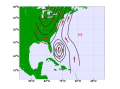 Figure 21.2: Map of pressure and winds 10,000 feet (3 km) above the surface at 5 AM on September 20th, 1938, constructed from balloon observations. Lines of equal pressure are shown by black curves, with L and H denoting high and low pressure. Red arrows show wind direction. Figure 21.2: Map of pressure and winds 10,000 feet (3 km) above the surface at 5 AM on September 20th, 1938, constructed from balloon observations. Lines of equal pressure are shown by black curves, with L and H denoting high and low pressure. Red arrows show wind direction. |
||
Figure 21.3: Pressure and winds at 10,000 feet at 5 AM on September 21st, 1938
| ||
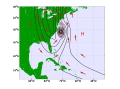 Figure 21.3: Map of pressure and winds 10,000 feet (3 km) above the surface at 5 AM on September 21st, 1938, constructed from balloon observations. Lines of equal pressure are shown by black curves, with L and H denoting high and low pressure. Red arrows show wind direction.
 |
||
Figure 21.5: Flooding at Ware, Massachusetts
| ||
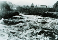 Figure 21.5: Flooding took out this bridge at Ware, Massachusetts NOAA Central Library Photo Collection. Figure 21.5: Flooding took out this bridge at Ware, Massachusetts NOAA Central Library Photo Collection. |
||
Figure 21.6: Hartford, Connecticut after the hurricane
| ||
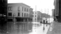 Figure 21.6: Downtown Hartford, Connecticut after the hurricane (photo by Dr. Edward N. Lorenz).
 |
||
Figure 22.1: Rogue wave
| ||
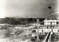 Figure 22.1: A rogue wave looms astern of a merchant ship in the Bay of Biscay. Although this photo was not taken in a hurricane, it shows the kind of sea one might encounter in such storms. NOAA Central Library Photo Collection. Figure 22.1: A rogue wave looms astern of a merchant ship in the Bay of Biscay. Although this photo was not taken in a hurricane, it shows the kind of sea one might encounter in such storms. NOAA Central Library Photo Collection. |
||
Figure 22.2: Wave packets
| ||
 Figure 22.2: Wave packets modulate the size of individual waves within them. In the case of deep water waves, the packets move at half the speed of individual wave crests.
 |
||
Figure 22.3: Wave packets in four quadrants of a storm
| ||
 Figure 22.3: Wave packets produced by a northern hemisphere hurricane moving toward the northwest. For simplicity, we consider wave packets in four quadrants of the storm. Figure 22.3: Wave packets produced by a northern hemisphere hurricane moving toward the northwest. For simplicity, we consider wave packets in four quadrants of the storm. |
||
Figure 22.6: Hurricane waves near Miami
| ||
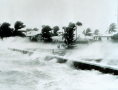 Figure 22.6: Wind-drive waves pour over a seawall during a hurricane near Miami, Florida. NOAA Central Library Photo Collection.
 |
||
Figure 22.7: Hurricane Carol waves
| ||
 Figure 22.7: Huge waves batter Old Lyme, Connecticut, during Hurricane Carol of 1954. NOAA Central Library Photo Collection. Figure 22.7: Huge waves batter Old Lyme, Connecticut, during Hurricane Carol of 1954. NOAA Central Library Photo Collection. |
||
Figure 24.1: Hurricane Mitch
| ||
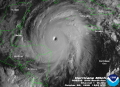 Figure 24.1: Hurricane Mitch, as photographed from a geostationary satellite, at 12:45 UTC on 26 October, 1998. NOAA/National Climatic Date Center.
 |
||
Figure 24.2: Radar reflectivity in the eye of Hurricane Floyd of 1999
| ||
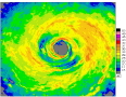 Figure 24.2: Radar reflectivity measure from a hurricane reconnaissance aircraft flying in the eye of Hurricane Floyd of 1999. Map is 360 km (225 miles) square. The radar reflectivity measures roughly how much rain, snow and hail is in the air. Courtesy of Frank Marks, Hurricane Research Division, NOAA-AOML, Miami, Florida. Figure 24.2: Radar reflectivity measure from a hurricane reconnaissance aircraft flying in the eye of Hurricane Floyd of 1999. Map is 360 km (225 miles) square. The radar reflectivity measures roughly how much rain, snow and hail is in the air. Courtesy of Frank Marks, Hurricane Research Division, NOAA-AOML, Miami, Florida. |
||
Figure 24.3: Radar reflectivity in Hurricane Gilbert of 1988
| ||
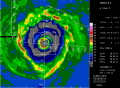 Figure 24.3: Radar reflectivity in Hurricane Gilbert of 1988, made from a reconnaissance aircraft flying at 2.6 km altitude. The white lines show the aircraft track, and the white barbs show the direction and speed of the wind measured by the aircraft. Each short barb is worth 5 kts, the longer barbs 10 kts, and the triangles 50 kts. The map is 240 km square. Courtesy of Frank Marks, Hurricane Research Division, NOAA-AOML, Miami, Florida.
 |
||
Figure 24.4: TRMM rainfall in an Arabian Sea tropical cyclone
| ||
 Figure 24.4: Radar reflectivity in an Arabian Sea tropical cyclone, measured from space in NASA's Tropical Rainfall Measurement Mission (TRMM). The colors show the radar reflectivity while the white shading represents a convectional infrared image of the storm's clouds. Naval Research Laboratory photo. Figure 24.4: Radar reflectivity in an Arabian Sea tropical cyclone, measured from space in NASA's Tropical Rainfall Measurement Mission (TRMM). The colors show the radar reflectivity while the white shading represents a convectional infrared image of the storm's clouds. Naval Research Laboratory photo. |
||
Figure 24.5: The precipitation efficiency of three types of atmospheric convection
| ||
 Figure 24.5: The precipitation efficiency of three types of atmospheric convection. "Trade" cumulus clouds (left) are shallow and ascend into dry air; all the water droplets eventually evaporate and so the precipitation efficiency is zero. In ordinary thunderstorms (center), roughly half the water vapor that rises through cloud base eventually reaches the surface as rain. In the humid eyewalls of hurricanes, almost all the water vapor that rises through clouds base falls to the surface as rain. In each figure, the graphs show typical vertical profiles of relative humidity.
 |
||
Figure 24.6: Airflow in a circular vortex with and without friction
| ||
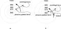 Figure 24.6: Airflow in a circular vortex without (a) and with (b) friction. The circles are curves of equal pressure (isobars), with lowest pressure at the vortex center. The "pressure gradient force" accelerates air toward lower pressure. Without friction (a), this force is exactly balanced by the centrifugal force of the air going around the vortex. Friction slows this airflow (b), reducing the centrifugal force and allowing air to spiral in towards the storm center. Figure 24.6: Airflow in a circular vortex without (a) and with (b) friction. The circles are curves of equal pressure (isobars), with lowest pressure at the vortex center. The "pressure gradient force" accelerates air toward lower pressure. Without friction (a), this force is exactly balanced by the centrifugal force of the air going around the vortex. Friction slows this airflow (b), reducing the centrifugal force and allowing air to spiral in towards the storm center. |
||
Figure 24.7: Total amount of rainfall accumulated at points 24 km to the right of the track of a northern hemisphere hurricane simulated by a computer model
| ||
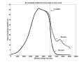 Figure 24.7: Total amount of rainfall accumulated at points 24 km to the right of the track of a northern hemisphere hurricane simulated by a computer model, displayed as a function of the distance along the storm's track. The storm is assumed to be moving at 15 MPH. On the left side, the storm intensifies over the ocean and its rainfall increases. After traveling 6,000 km, the storm makes landfall. Over dry land, the rain quickly diminishes as the storm moves inland, while over a swamp it lasts somewhat longer.
 |
||
Figure 24.8: Accumulated rainfall from Hurricane Mitch
| ||
 Figure 24.8: Map showing accumulated rainfall, in millimeters, from Hurricane Mitch in Nicaragua. After S.H. Cannon et al., 2001: Landslide Response to Hurricane Mitch Rainfall in Seven Study Areas in Nicaragua. U.S.G.S. Open file report 01-412-A. Figure 24.8: Map showing accumulated rainfall, in millimeters, from Hurricane Mitch in Nicaragua. After S.H. Cannon et al., 2001: Landslide Response to Hurricane Mitch Rainfall in Seven Study Areas in Nicaragua. U.S.G.S. Open file report 01-412-A. |
||
Figure 25.2: Track of the Galveston Hurricane of 1943
| ||
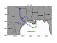 Figure 25.2: Track of the Galveston Hurricane of 1943; the first storm to be penetrated by aircraft. The location of Duckworth's base in Bryan, Texas, is indicated.
 |
||
Figure 25.4: Variation with distance from storm center of the horizontal wind velocity in a computer model
| ||
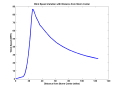 Figure 25.4: Variation with distance from storm center of the horizontal wind velocity in a computer model storm that has just undergone rapid intensification. Note how quickly the wind speed rises, from only about 5 MPH at 12 miles radius to 85 MPH at 25 miles. A NOAA-P3 may have flown through a wind field like this in Hurricane Hugo of 1989. Figure 25.4: Variation with distance from storm center of the horizontal wind velocity in a computer model storm that has just undergone rapid intensification. Note how quickly the wind speed rises, from only about 5 MPH at 12 miles radius to 85 MPH at 25 miles. A NOAA-P3 may have flown through a wind field like this in Hurricane Hugo of 1989. |
||
Figure 25.4, right: Variation with distance from storm center of the vertical air velocity in a computer model storm
| ||
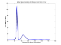 Figure 25.4, right: Variation with distance from storm center of the vertical air velocity in a computer model storm that has just undergone rapid intensification. Between 20 and 25 miles there is a big increase in updraft speed. A NOAA-P3 may have flown through a wind field like this in Hurricane Hugo of 1989.
 |
||
Figure 26.1: Track of Hurricane Camille
| ||
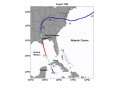 Figure 26.1: Track of Hurricane Camille of 1969. Numbers indicate dates in Auguest, with positions recorded at midnight Greenwich Mean Time. Colors on tracks show storm strength category: Dark blue: tropical storm; light blue: Cat1; green: Cat2; yellow: Cat3; orange: Cat4; red: Cat5. Figure 26.1: Track of Hurricane Camille of 1969. Numbers indicate dates in Auguest, with positions recorded at midnight Greenwich Mean Time. Colors on tracks show storm strength category: Dark blue: tropical storm; light blue: Cat1; green: Cat2; yellow: Cat3; orange: Cat4; red: Cat5. |
||
Figure 26.2: Storm surge during Hurricane Camille, estimated using a computer model
| ||
 Figure 26.2: Storm surge during Hurricane Camille, estimated using a computer model. The model's predictions agree well with tide gauge measurements. Courtesy Wilson Shaffer, National Weather Service/NOAA.
 |
||
Figure 26.3: Downtown Pass Christian, after Camille
| ||
 Figure 26.3: Downtown Pass Christian, after Camille. City Hall is in the background on the left. Courtesy Fred Hutchings. Figure 26.3: Downtown Pass Christian, after Camille. City Hall is in the background on the left. Courtesy Fred Hutchings. |
||
Figure 26.4: Evolution of Camille's maximum winds speeds
| ||
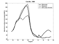 Figure 26.4: Observed evolution of Camille's maximum winds speeds (solid curve) together with two computer simulations: A simulation using the standard Gulf of Mexico upper-ocean conditions (dashed curve) and one using upper ocean temperature typical of the Loop Current (dash-dot curve).
 |
||
Figure 26.5: West-east cross-section through the central Gulf of Mexico
| ||
 Figure 26.5: West-east cross-section through the central Gulf of Mexico made using instruments deployed from ships, in August, 1965. Contour lines are drawn at intervals of 1o C, with the coldest water at 10o C and the warmest water at 29o C . The Loop Current is evident at the far right side of the diagram. After D.F. Leipper, "Observed Ocean Conditions after Hurricane Hilda, 1964", J. Atmos. Sci., 24. Figure 26.5: West-east cross-section through the central Gulf of Mexico made using instruments deployed from ships, in August, 1965. Contour lines are drawn at intervals of 1o C, with the coldest water at 10o C and the warmest water at 29o C . The Loop Current is evident at the far right side of the diagram. After D.F. Leipper, "Observed Ocean Conditions after Hurricane Hilda, 1964", J. Atmos. Sci., 24. |
||
Figure 27.1: Outer bands.
| ||
 Figure 27.1: Outer bands in Hurricane Gloria of 1985. Photo by author.
 |
||
Figure 27.2: Altostratus in Hurricane Gloria
| ||
 Figure 27.2: Thick altostratus overcast and outer bands in Hurricane Gloria of 1985. Photo by author. Figure 27.2: Thick altostratus overcast and outer bands in Hurricane Gloria of 1985. Photo by author. |
||
Figure 27.3: Sea surface in Hurricane Fabian
| ||
 Figure 27.3: Sea surface in Hurricane Fabian of 2003. Photo by author.
 |
||
Figure 27.5: The eye of Hurricane Georges
| ||
 Figure 27.5: The eye of Hurricane Georges in photo taken from a reconnaissance aircraft. The eyewall at right is casting a shadow across part of the eyewall ahead. Courtesy of Michael Black, Hurricane Research Division, NOAA-AOML, Miami, Florida. Figure 27.5: The eye of Hurricane Georges in photo taken from a reconnaissance aircraft. The eyewall at right is casting a shadow across part of the eyewall ahead. Courtesy of Michael Black, Hurricane Research Division, NOAA-AOML, Miami, Florida. |
||
Figure 27.6: The inner edge of the eyewall of Hurricane Gilbert
| ||
 Figure 27.6: The inner edge of the eyewall of Hurricane Gilbert of 1988, as seen from a NOAA reconnaissance aircraft. Courtesy of Michael Black, Hurricane Research Division, NOAA-AOML, Miami, Florida.
 |
||
Figure 28.1: Track of the Great Cyclone of November, 1970
| ||
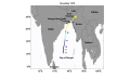 Figure 28.1: Track of the Great Cyclone of November, 1970. Numbers indicate dates, showing the storm position at midnight, Greenwich Mean Time. Colors on tracks show storm strength category: Dark blue: tropical storm; light blue: Cat1; green: Cat2; yellow: Cat3; orange: Cat4; red: Cat5. Figure 28.1: Track of the Great Cyclone of November, 1970. Numbers indicate dates, showing the storm position at midnight, Greenwich Mean Time. Colors on tracks show storm strength category: Dark blue: tropical storm; light blue: Cat1; green: Cat2; yellow: Cat3; orange: Cat4; red: Cat5. |
||
Figure 28.2: Computer simulation of the maximum wind speeds in the Great Cyclone of 1970
| ||
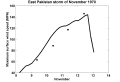 Figure 28.2: Computer simulation of the maximum wind speeds in the Great Cyclone of 1970, based on the observed storm track and estimates of the peak wind on November 8th and 9th from satellite pictures. Dots represent independent estimates based on satellite imagery, made by Dr. Mark Lander.
 |
||
Figure 29.1: Eastward velocity
| ||
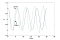 Figure 29.1: The eastward velocity as a solution to equations (29.2) and (29.3) in book. The blue curve is the exact solution, the green curve is the numerical solution with a time step of 0.01 hour, and the dashed black line is the solution with a time step of 0.7 hour. Figure 29.1: The eastward velocity as a solution to equations (29.2) and (29.3) in book. The blue curve is the exact solution, the green curve is the numerical solution with a time step of 0.01 hour, and the dashed black line is the solution with a time step of 0.7 hour. |
||
Figure 29.2: Forecasts of the eastward velocity
| ||
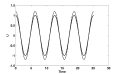 Figure 29.2: The forecast of the eastward velocity u starting from an erroneous initial state is shown by the dashed curve; the solid curve shows the correct solution.
 |
||
Figure 29.3: Two solutions of the Lorenz equations
| ||
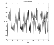 Figure 29.3: Two solutions of the Lorenz equations for the variable u as a function of time. The second solution begins from a state that differs from that used in the first solution by one part in a thousand. Figure 29.3: Two solutions of the Lorenz equations for the variable u as a function of time. The second solution begins from a state that differs from that used in the first solution by one part in a thousand. |
||
Figure 29.4: Eight forecasts of the movement of a hurricane
| ||
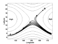 Figure 29.4: Eight forecasts of the movement of a hurricane, using the same model but starting from eight slightly different estimates of its initial location, at lower right.
 |
||
Figure 29.5: Numerical forecasts of the track of Hurricane Kate in 2003
| ||
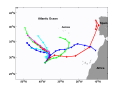 Figure 29.5: Numerical forecasts of the track of Hurricane Kate in 2003. Each track represents the prediction of a different numerical model, starting from Isidore's observed location. Figure 29.5: Numerical forecasts of the track of Hurricane Kate in 2003. Each track represents the prediction of a different numerical model, starting from Isidore's observed location. |
||
Figure 30.1: Track of Cyclone Tracy
| ||
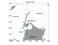 Figure 30.1: Track of Cyclone Tracy of 1974. Numbers show dates in December, with positions recorded at midnight Greenwich Mean Time. Colors on tracks show storm strength category: Dark blue: tropical storm; light blue: Cat1; green: Cat2; yellow: Cat3; orange: Cat4; red: Cat5.
 |
||
Figure 30.2: Maximum wind speed in Tropical Cyclone Tracy
| ||
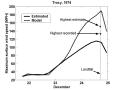 Figure 30.2: Maximum wind speed in Tropical Cyclone Tracy. The solid curve shows the official estimate and the dashed curve shows the results of a computer simulation. The highest recorded wind speed and the highest estimated wind speed are also shown. Figure 30.2: Maximum wind speed in Tropical Cyclone Tracy. The solid curve shows the official estimate and the dashed curve shows the results of a computer simulation. The highest recorded wind speed and the highest estimated wind speed are also shown. |
||
Figure 31.1: Track of Hurricane Andrew
| ||
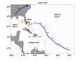 Figure 31.1: Track of Hurricane Andrew. Numbers indicate dates in Auguest, with positions recorded at midnight Greenwich Mean Time. Colors on tracks show storm strength category: Dark blue: tropical storm; light blue: Cat1; green: Cat2; yellow: Cat3; orange: Cat4; red: Cat5.
 |
||
Figure 31.2 Hurricane Andrew
| ||
 Figure 31.2: Andrew taking aim at south Florida, 12:31 UTC August 23 1992. NOAA/OSEI. Figure 31.2: Andrew taking aim at south Florida, 12:31 UTC August 23 1992. NOAA/OSEI. |
||
Figure 31.3: History of the maximum wind speed in Hurricane Andrew
| ||
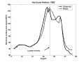 Figure 31.3: History of the maximum wind speed in Hurricane Andrew. Observations are shown by the solid curve; the computer simulation by a dashed curve.
 |
||
Figure 32.3: Annual number of tropical cyclones worldwide
| ||
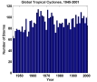 Figure 32.3: Annual number of tropical cyclones worldwide, from 1945 to 2001. Figure 32.3: Annual number of tropical cyclones worldwide, from 1945 to 2001. |
||
Figure 32.4: Annual number of tropical cyclones over the North Atlantic
| ||
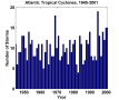 Figure 32.4: Annual number of tropical cyclones over the North Atlantic, from 1945 to 2001.
 |
||
Figure 32.5: Hurricane power disipation vs. ENSO
| ||
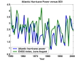 Figure 32.5: An estimate of the total amount of power dissipated annually by Atlantic tropical cyclones (solid curve) and the "Southern Oscillation Index" (SOI), a measure of El Niño. When the SOI is small, El Niño is usually present. The Atlantic hurricane power has been scaled to have approximately the same range as the SOI. Figure 32.5: An estimate of the total amount of power dissipated annually by Atlantic tropical cyclones (solid curve) and the "Southern Oscillation Index" (SOI), a measure of El Niño. When the SOI is small, El Niño is usually present. The Atlantic hurricane power has been scaled to have approximately the same range as the SOI. |
||
Figure 32.6: Computer simulations of the maximum wind speed in Hurricane Andrew
| ||
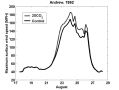 Figure 32.6: Computer simulation of the maximum wind speed in Hurricane Andrew in the present climate (solid curve) and with hypothetical global warming that raises tropical sea surface temperatures by 4 F (dashed curve).
 |
||
Figure 32.7: SST today and during the Eocene
| ||
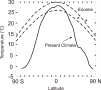 Figure 32.7: Estimate of the sea surface temperature distribution during the early Eocene (about 50 million years ago; dashed lines show the range of estimates), compared to the present distribution (solid curve). Figure 32.7: Estimate of the sea surface temperature distribution during the early Eocene (about 50 million years ago; dashed lines show the range of estimates), compared to the present distribution (solid curve). |
||
Epilogue: Hurricane Jeanne
| ||
 Epilogue: Hurricane Jeanne closes in on Florida, September 2004
 |
||